Product updates
2021
23 Nov 2021: Button messages
2 Nov 2021: Playbooks Launch
20 Sept 2021: The end of Chatbase
9 Sept 2021: Data Export API
9 August 2021: Thread data export
22 June 2021: You know best!
21 June 2021: Sample content for templates
17 June 2021: Important security improvements
8 June 2021: Community Playbooks
18 March 2021: Improved billing transparency
17 March 2021: Share the amazing work you do
8 March 2021: Contextual replies and profile settings that suit you
22 Feb 2021: Button automation
18 Feb 2021: Updates to the fallback channel
17 Feb 2021: Contacts and labels data added to BQ
10 Feb 2021: Temporary limitations while we do a Search infrastructure upgrade
5 Feb 2021: Snappier and easier-to-use modals
3 Feb 2021: Add media to templates
27 Jan 2021: Add media or stickers to custom replies
21 Dec 2020: A last big release to celebrate the year
2 Dec 2020: Delete a template, get more insights and send stickers via the API
17 Nov 2020: Delete a user message
23 October 2020: Insights
19 October 2020: Hidden numbers by default
8 September 2020: Contact Profile
11 August 2020: Learn in Turn
3 August 2020: Add a list to your Exact match automations
30 July 2020: Manage your message template spend
15 July 2020: Data storage and rejection reasons
10 July 2020: WhatsApp profile and Login
2022
21 Nov 2022: A new look user interface!
18 Nov 2022: Build with feedback
13 Oct 2022: Reminders are in Beta!
11 Oct 2022: Building blocks
10 Oct 2022: New Turn.io Developer Docs
19 Sept 2022: More fields available in the Data Export API
15 Sept 2022: Shorter messages are better
13 Sept: Changes to the contact details API endpoint
7 Sept 2022: Stack improvements
1 Sept 2022: Learn to Build with Stacks.
19 Aug 2022: Better human support with Message Collections
18 Aug 2022: Deprecating Goals
17 Aug 2022: Build for your audience
16 Aug: Pick a date range
28 July 2022: Custom voice notes
14 July 2022: Get Stacking! Build more complex services.
4 July 2022: Faster insights
29 Jun 2022: Reminders are live!
8 Jun 2022: Track your conversations
3 May 2022: Reach out with Reminders
21 Apr 2022: Payments made easy!
3 Apr 2022: Follow up at an exact local time
20 Mar 2022: Small changes, big wins!
8 Mar 2022: Security enhancements
16 Feb 2022: Add resources to Playbooks and export Contacts
26 Jan 2022: Try out emojis in buttons, but no more 'templates' in sandboxes
5 Jan 2022: Use buttons in threads
2023
12 Dec 2023: Never start from scratch
2 Aug 2023: PUT and PATCH functions now available within stacks
26 Jul 2023: Uninterrupted conversations
19 Jul 2023: More freedom and flexibility with code blocks
14 Jul 2023: Get your stack results in BigQuery
12 Jul 2023: Start a journey from within another journey
8 Jul 23: Your name, your number
4 Jul 2023: Better chat and insights performance
30 June 2023: Stacks logging API (beta)
27 Jun 203: Visualised connections
19 Jun 2023: Add notes on the Canvas
14 Jun 2023: Speed up conversation assignment
26 May 2023: Microsoft Single Sign-on
15 May 2023: The latest Canvas improvements
24 Apr 2023: Logging in Stacks
20 Apr 2023: The no-code Canvas is live!
28 Mar 2023: Important changes to template categories
30 Mar 2023: Integrate with Huggingface.co
23 Mar 2023: Answer conversations on mobile
20 Mar 2023: Act on the user's last interaction
17 Mar 2023: Scan the list for unassigned chats
10 Mar 2023: Template with buttons in stacks
9 March 2023: More data in BigQuery!
16 Feb 2023: More possibilities for scheduling stacks
13 Feb 2023: Automatically mark messages as DONE
3 Feb 2023: Search with quick picks or date&time filters
17 Jan 2023: Add hyperlinks to Playbooks
11 Jan 2023: Export specific responses from Stacks
23 Aug 2023: Block a user
22 Nov 2023: The new Inbox
30 Aug 2023: A series of Trust and Safety Playbooks
12 Sep 2023: Templates on the Canvas
18 Oct 2023: Interruption-free conversations on Turn
19 Dec 2023: Triggers in Build
13 Sep 2023: A dedicated Unassigned collection
5 Sep 2023: Hide personal information
16 Oct 2023: A reimagined Turn Helpdesk
18 Oct 2023: More joy on the Canvas!
16 Jan 2023: Voice note transcriptions
3 Aug 2023: Suggested replies
18 Oct 2023: An improved billing system
2024
2 Dec 2024: Making chat sorting even better
05 Nov 2024: Seamless handover between a human and a bot
28 Oct 2024: Journey interaction timeouts
28 Oct 2024: More roles and better permissions
18 Oct 2024: Customise your operator capacity
16 Oct 2024: Channel API
11 Oct 2024: Multiple AI assistants
9 Oct 2024: WhatsApp shortcuts
9 Oct 2024: Automatic closure of inactive chats
7 Oct 2024: Export Message Status Data from the REST API
26 Sep 2024: Introducing staging for Journeys
23 Sep 2024: AI translations in the Inbox
10 Sep 2024: Journey Rest API
29 Aug 2024: Send reminders to Segments
20 Aug 2024: A version history for Journeys
15 Aug 2024: Faster and more reliable
17 Jul 2024: Close and unassign a conversation
17 Jun 2024: More subscription details
14 Jun 2024: Deleting a contact
13 Jun 2024: Simulator improvements
12 Jun 2024: More than one trigger option
12 Jun 2024: Retiring the Turn NLU integration
7 Jun 2024: Manage custom fields via People Settings
28 May 2024: More informative chat previews
24 May 2024: Allow Reminders to start a journey
24 May 2024: Start a chat with People
20 May 2024: People
20 May 2024: Routing automatically distributes chats
20 May 2024: Journey logs
9 May 2024: Data and variables in journeys
7 May 2024: Get journey specific Sentry errors
19 Apr 2024: Start a journey from the inbox
10 Apr 2024: Duplicate or delete journeys in bulk
9 Apr 2024: React to messages
4 Apr 2024: Reactions
2 Apr 2024: Backwards incompatible change on Flow Results API
27 Mar 2024: First-time visitors
25 Mar 2024: Handling late responses
22 Mar 2024: Basic operator insights
19 Mar 2024: Pin your favourite collections
14 Mar 2024: Get 10% discount
26 Feb 2024: "First Message Received At" profile field
20 Feb 2024: Mentions
16 Feb 2024: Give us feedback
13 Feb 2024: More filtering options in triggers
6 Feb 2024: Improve team work with notes
6 Feb 2024: Update profile fields block
30 Jan 2024: Convert Threads to Journeys
29 Jan 2024: Warning emails when conversation credits are low
24 Jan 2024: Pin your favourite profile fields
24 Jan 2024: Journeys are the way forward
16 Jan 2024: Branch the journey
9 Jan 2024: The conversation is yours
23 Apr 2025: Upgraded Inbox — Faster, Clearer, Better!
28 Feb 2025: Introducing Journey Insights
20 Feb 2025: The Journeys API now automatically publishes journeys on creation
19 Feb 2025: Unlocking the power of AI for your chat service
18 Feb 2025: Turn.io is now available in Portuguese
7 Jan 2025: Build Journeys faster with keyboard shortcuts
FAQs
General FAQs
What is an MAU (Monthly Active User)?
Can I use Turn.io in my country?
What is Turn.io?
Can I get a free trial?
What is Google-backed?
What support do I get with my subscription?
Product FAQs
Subscription statuses explained
Can I format content with bold, italics etc?
How to help a user that is stuck within a Journey?
How to change our chat service display name?
My sandbox isn't working? How do I connect?
Can I attach more than one image, audio clip, video or document to a message?
My emoji trigger isn't working?
If a journey is updated, what happens to people in an active session?
How do I extract data out of Turn.io?
Can I edit and/or delete a custom profile field?
What are 'collections'?
How to work as a team
What media can I use in messages?
Why is my video not sending?
How to setup subscription billing
Why can't I see chats that I've sent messages to?
What is the difference between a member and an admin?
How do I add other contact fields?
What are the options to get data from Turn.io?
I found a bug..
How to add team members?
WhatsApp FAQs
Can I use WhatsApp Groups on the API?
Can you give me examples of approved message templates?
What languages are allowed for message templates?
Why has my template(s) been rejected?
How are conversations charged?
Example of user-initiated vs business-initiated conversations
Can I send a free-form message?
Are all conversations paid?
Issue recreating a template
Developer FAQs
How secure is my data?
Securing Data Localization in the Desired Region During Bigquery Integration
What is 1013 error code?
How can I export data from Turn?
Webhook Troubleshooting
What happens to my phone number If I offboard or leave after trial?
Implications of moving to the WhatsApp Cloud API
Why am I seeing error code "131056"?
Get started!
Get a WhatsApp line: Step-by-step instructions, with a video
An introduction to the WhatsApp Business Platform
Your WABA application checklist
Display name guidelines
What is Business Verification?
Your Business Verification checklist
Help! I got an error whilst doing embedded sign-up?
Help! I'm struggling to get my business verified?
Help! I uploaded the wrong document for Business Verification?
Help! The "Start Verification" button is greyed-out?
Help! Why hasn't my display name been approved?
Help! Our display name got rejected?
Help! What happens if we're not verified within 30 days?
Help! I can see my number in Turn but it's not working?
Help! Can I have a WhatsApp number for a different country than my business registration?
Help! We are a government entity, how do we do Facebook business verification?
Help! What is a Facebook Business Manager Account?
Help! What is a BSP?
What number do I need for my service?
Help! What is two-factor authentication (2FA)?
Is it possible to set-up WhatsApp on my phone using my chatbot service number?
How to create a sandbox in a new organisation
Approving Facebook business manager account
How can I get the green checkmark (official business account)?
How to Plan for Growth on WhatsApp
Try Turn.io using a Sandbox
How to use Turn.io
Introduction
Inbox
A short tour of Helpdesk
Contact Profile
Personal Information Privacy
Search and Collections
Labels
The Reply Box
Routing
Team roles
Content
How to load content
How users engage with content
Structure and plan your content
Create your first menu
How to send custom replies
How to send custom voice notes?
How to add a button message
How to upload stickers
How to delete a message that a user sent?
Journeys
Get started with journeys
Triggers
How to use the Branch block in journeys?
Journeys Data
Save important responses to the contact profile or as downloadable results
How to use the Settings sidebar?
Where do I start with code journeys?
Build chat journeys specific to your audience
How to download and duplicate code journeys
Where do I find code journey documentation?
How can I use a template button pressed to start a Journey?
Using media in no-code journeys
When I do a preview, it appears as [DEBUG]
Launching at Scale? Here’s a checklist for a smooth rollout
Using the type of message sent by a user as a trigger
AI
Intro to AI in Turn.io
Integrate with an AI provider
Train your assistant
AI in the Helpdesk
AI in Journeys
Start from a Playbook
Cost of AI
Data Handling and Privacy
Reminders
WhatsApp's quality rating and messaging limits
How to send or schedule a reminder?
How many people can I send Reminders to?
Contact search examples
Understanding Reminders' statuses and stats
People
Message templates
How to re-connect with users using message templates
Create and submit your template(s) for approval
Send message templates to users
Understanding WhatsApp’s Per-User Marketing Template Message Limit
How to add buttons to a template
How to add media to a template
Delete or copy a template
Paused Message Templates
Guiding and tracking
Set up a data connection to BigQuery
Understand your BigQuery data and queries
Conversation billing
How to top up your 'available amount' for conversations?
Refining Raw Turn Data in BigQuery
Measuring video engagement on Journeys
Example queries for your data
Insights
Automation
How to set up basic automations
The available trigger types in Automations
The available action types
How to set up advanced automations
How to set up multiple language automation
How to set up a follow-up timer
Automation tips & tricks
Triggers explained: Message received STARTS WITH...
Triggers explained: Message received EXACTLY matches...
Triggers explained: Message received does NOT exactly match...
Triggers explained: Message received is a BUTTON PRESSED...
Triggers explained: Message received is from a specific COUNTRY...
Triggers explained: Message received is AUTOMATICALLY labelled...
Triggers explained: Message received from a specific CONTACT PROFILE......
How to send stickers in automation
How to set up a sequential content delivery experience using Automation and Custom Profile Fields
How to send 'Welcome back' message to returning users
Use a follow up timer based on local time
Threads
The ABC of threads
How to create a thread
Different thread card types
How to add skip logic to your thread
How to use personalisation in threads
Start a thread when a user reply with a button.
Export your thread data
Create a sequential learning experience with Threads
How to log in to your account
What is Chat for Impact?
The WhatsApp Business Platform
Conversation-billing changes effective June 1, 2023
Three key rules of engagement
A closer look at the WhatsApp Business API
Understanding conversation-based pricing
Message types: Session vs. Template messages
Message template rules
Message template troubleshooting
Reasons why your template(s) gets rejected
You need opt-in to initiate messages
Human escalation path required
WhatsApp Terms & Privacy Policy updates
Examples of how to upgrade to the next tier
Important updates to template categories
Una introducción a la WhatsApp Business API
What's an OBO request?
Connect with your users on chat
Use a ‘wa.me’ link and QR code to market your service
Get user consent in a WhatsApp conversation
Use automation to collect opt-in
Manage your online presence by updating your WhatsApp profile
Design an impactful solution
Great ways of marketing your chat service
Create good chat service content
Varying interpretations of emoji
Changing behaviour is difficult. Here's some help!
For developers
Turn.io API documentation
Integrations
Where do I find my credentials for the Message Template API?
How do I create message templates via the API?
Upload and send a sticker via the API
Replacing the Contact Export API
New to webhooks?
Custom Integrations
How to set up a RapidPro integration
Notify your team over email when someone needs urgent help
How to mark messages as read
Getting data from the Contacts API endpoint
Getting Suggested Replies with ChatGPT
Why are you receiving webhook failure alerts?
API calls returns 200 status for messages outside the Conversation Windows
Upload media to Turn in order to use in code-based journeys
- All Resources
- Product updates
- 2022
- 21 Nov 2022: A new look user interface!
21 Nov 2022: A new look user interface!
 Updated
by Neelke Stadler
Updated
by Neelke Stadler
Don't we all just love a fresh breath of air! We updated Turn's look and feel.
Hi, nice to meet you 😎!
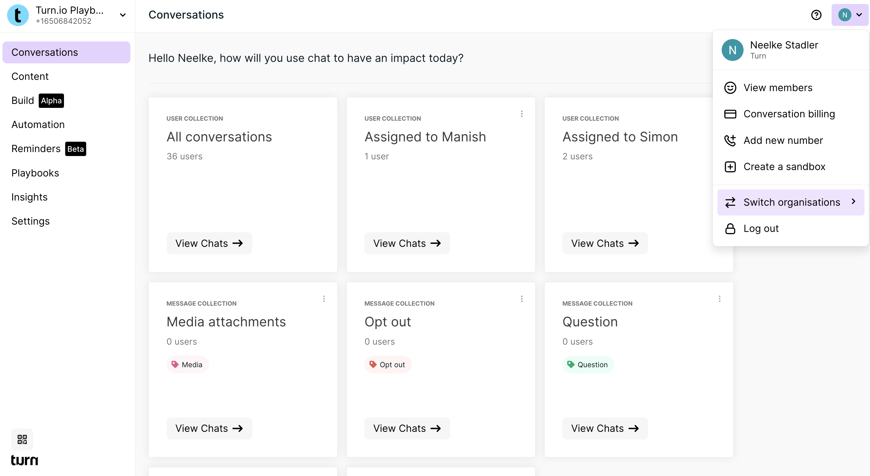
This year we updated our brand to better align with our values and the diversity of our global audience.
At Turn our vision is to make effective support accessible to vulnerable people everywhere. We have never been more passionate to work towards this goal alongside you as the Chat for Impact community.
We want our brand to represent who we are. Our colour palette is vibrant and versatile; it represents our bold, fun and cheerful side. It also connects us with the culture and spirit of the ethnically diverse people we want to impact and serve; their resilience and positive spirit in overcoming less than ideal situations in their life.
Our typography choices are motivated by accessibility and consistency across multiple languages. We choose to use fonts that are going to have good readability on low-resolution screens and that can be used around the world.
You will see more of this come through in the user interface.
Key updates to note
We added a short tour in the product to show you around the most important improvements:
- Dashboard is now named Conversations. Although it looks slightly different and has a new name all the functionality remains unchanged.
- Search messages is now only visible on the Conversations page. The way you search remains unchanged.
- Switching organisation has moved, making it a more clear call to action.
- Finding your QR code and wa.me link have moved downwards just above the Turn logo.
- Lastly, a few buttons have a new colour and position. The
View chatsbutton on Collections changed from teal to grey, with purple when you hover to click it. Buttons to add Content, Threads and Reminders changed from teal to black, and have been moved into the header.
Enjoy the new look! ✨