Product updates
2021
23 Nov 2021: Button messages
2 Nov 2021: Playbooks Launch
20 Sept 2021: The end of Chatbase
9 Sept 2021: Data Export API
9 August 2021: Thread data export
22 June 2021: You know best!
21 June 2021: Sample content for templates
17 June 2021: Important security improvements
8 June 2021: Community Playbooks
18 March 2021: Improved billing transparency
17 March 2021: Share the amazing work you do
8 March 2021: Contextual replies and profile settings that suit you
22 Feb 2021: Button automation
18 Feb 2021: Updates to the fallback channel
17 Feb 2021: Contacts and labels data added to BQ
10 Feb 2021: Temporary limitations while we do a Search infrastructure upgrade
5 Feb 2021: Snappier and easier-to-use modals
3 Feb 2021: Add media to templates
27 Jan 2021: Add media or stickers to custom replies
21 Dec 2020: A last big release to celebrate the year
2 Dec 2020: Delete a template, get more insights and send stickers via the API
17 Nov 2020: Delete a user message
23 October 2020: Insights
19 October 2020: Hidden numbers by default
8 September 2020: Contact Profile
11 August 2020: Learn in Turn
3 August 2020: Add a list to your Exact match automations
30 July 2020: Manage your message template spend
15 July 2020: Data storage and rejection reasons
10 July 2020: WhatsApp profile and Login
2022
21 Nov 2022: A new look user interface!
18 Nov 2022: Build with feedback
13 Oct 2022: Reminders are in Beta!
11 Oct 2022: Building blocks
10 Oct 2022: New Turn.io Developer Docs
19 Sept 2022: More fields available in the Data Export API
15 Sept 2022: Shorter messages are better
13 Sept: Changes to the contact details API endpoint
7 Sept 2022: Stack improvements
1 Sept 2022: Learn to Build with Stacks.
19 Aug 2022: Better human support with Message Collections
18 Aug 2022: Deprecating Goals
17 Aug 2022: Build for your audience
16 Aug: Pick a date range
28 July 2022: Custom voice notes
14 July 2022: Get Stacking! Build more complex services.
4 July 2022: Faster insights
29 Jun 2022: Reminders are live!
8 Jun 2022: Track your conversations
3 May 2022: Reach out with Reminders
21 Apr 2022: Payments made easy!
3 Apr 2022: Follow up at an exact local time
20 Mar 2022: Small changes, big wins!
8 Mar 2022: Security enhancements
16 Feb 2022: Add resources to Playbooks and export Contacts
26 Jan 2022: Try out emojis in buttons, but no more 'templates' in sandboxes
5 Jan 2022: Use buttons in threads
2023
12 Dec 2023: Never start from scratch
2 Aug 2023: PUT and PATCH functions now available within stacks
26 Jul 2023: Uninterrupted conversations
19 Jul 2023: More freedom and flexibility with code blocks
14 Jul 2023: Get your stack results in BigQuery
12 Jul 2023: Start a journey from within another journey
8 Jul 23: Your name, your number
4 Jul 2023: Better chat and insights performance
30 June 2023: Stacks logging API (beta)
27 Jun 203: Visualised connections
19 Jun 2023: Add notes on the Canvas
14 Jun 2023: Speed up conversation assignment
26 May 2023: Microsoft Single Sign-on
15 May 2023: The latest Canvas improvements
24 Apr 2023: Logging in Stacks
20 Apr 2023: The no-code Canvas is live!
28 Mar 2023: Important changes to template categories
30 Mar 2023: Integrate with Huggingface.co
23 Mar 2023: Answer conversations on mobile
20 Mar 2023: Act on the user's last interaction
17 Mar 2023: Scan the list for unassigned chats
10 Mar 2023: Template with buttons in stacks
9 March 2023: More data in BigQuery!
16 Feb 2023: More possibilities for scheduling stacks
13 Feb 2023: Automatically mark messages as DONE
3 Feb 2023: Search with quick picks or date&time filters
17 Jan 2023: Add hyperlinks to Playbooks
11 Jan 2023: Export specific responses from Stacks
23 Aug 2023: Block a user
22 Nov 2023: The new Inbox
30 Aug 2023: A series of Trust and Safety Playbooks
12 Sep 2023: Templates on the Canvas
18 Oct 2023: Interruption-free conversations on Turn
19 Dec 2023: Triggers in Build
13 Sep 2023: A dedicated Unassigned collection
5 Sep 2023: Hide personal information
16 Oct 2023: A reimagined Turn Helpdesk
18 Oct 2023: More joy on the Canvas!
16 Jan 2023: Voice note transcriptions
3 Aug 2023: Suggested replies
18 Oct 2023: An improved billing system
2024
2 Dec 2024: Making chat sorting even better
05 Nov 2024: Seamless handover between a human and a bot
28 Oct 2024: Journey interaction timeouts
28 Oct 2024: More roles and better permissions
18 Oct 2024: Customise your operator capacity
16 Oct 2024: Channel API
11 Oct 2024: Multiple AI assistants
9 Oct 2024: WhatsApp shortcuts
9 Oct 2024: Automatic closure of inactive chats
7 Oct 2024: Export Message Status Data from the REST API
26 Sep 2024: Introducing staging for Journeys
23 Sep 2024: AI translations in the Inbox
10 Sep 2024: Journey Rest API
29 Aug 2024: Send reminders to Segments
20 Aug 2024: A version history for Journeys
15 Aug 2024: Faster and more reliable
17 Jul 2024: Close and unassign a conversation
17 Jun 2024: More subscription details
14 Jun 2024: Deleting a contact
13 Jun 2024: Simulator improvements
12 Jun 2024: More than one trigger option
12 Jun 2024: Retiring the Turn NLU integration
7 Jun 2024: Manage custom fields via People Settings
28 May 2024: More informative chat previews
24 May 2024: Allow Reminders to start a journey
24 May 2024: Start a chat with People
20 May 2024: People
20 May 2024: Routing automatically distributes chats
20 May 2024: Journey logs
9 May 2024: Data and variables in journeys
7 May 2024: Get journey specific Sentry errors
19 Apr 2024: Start a journey from the inbox
10 Apr 2024: Duplicate or delete journeys in bulk
9 Apr 2024: React to messages
4 Apr 2024: Reactions
2 Apr 2024: Backwards incompatible change on Flow Results API
27 Mar 2024: First-time visitors
25 Mar 2024: Handling late responses
22 Mar 2024: Basic operator insights
19 Mar 2024: Pin your favourite collections
14 Mar 2024: Get 10% discount
26 Feb 2024: "First Message Received At" profile field
20 Feb 2024: Mentions
16 Feb 2024: Give us feedback
13 Feb 2024: More filtering options in triggers
6 Feb 2024: Improve team work with notes
6 Feb 2024: Update profile fields block
30 Jan 2024: Convert Threads to Journeys
29 Jan 2024: Warning emails when conversation credits are low
24 Jan 2024: Pin your favourite profile fields
24 Jan 2024: Journeys are the way forward
16 Jan 2024: Branch the journey
9 Jan 2024: The conversation is yours
Coming soon: WhatsApp usernames and BSUIDs — what you need to know
10 Apr 2026: See why Reminders fail to deliver
3 Apr 2026: AI Evals, Logs and Simulations with Maxim
20 Mar 2026: Track Conversions from Click-to-WhatsApp ads
13 March 2026: Call Notes
6 Mar 2026: Manage Flows inside Turn.io
27 Feb 2026: Calls Routing
19 Feb 2026: Segment-based triggers
13 Feb 2026: Inbox notifications
4 Feb 2026: Agent Skills
28 Jan 2026: Exporting segments
26 Jan 2026: Journeys page revamp
19 Jan 2025: @last_message
16 Jan 2026: BigQuery Improvements
10 Jan 2026: Make Agents more Personal
18 Dec 2025: Collect data with Agents
18 Dec 2025: Showing active editors on the Journey canvas
15 Dec 2025: Improvements to arrows in Journeys
11 Dec 2025: Blocks other than templates can now be used for time based triggers
11 Dec 2025: Improved canvas menu
2 Dec 2025: WhatsApp Flows API
1 Dec 2025: Calling Availability
25 Nov 2025: WhatsApp Flows in Journeys
21 Nov 2025: Adding Emoji reactions to incoming messages 💥
17 Nov 2025: The Wait card
14 Nov: Improved human-bot handovers
7 Nov 2025: Catalogs: Showcase your Products natively in WhatsApp
31 Oct 2025: Introducing Location Requests in Journeys
30 Oct 2025: Agents & Memory
23 Oct 2025: Improvements to Journeys - Everything you need to know
10 Oct 2025: GPT-5
3 Oct 2025: Introducing Universal AI Model Support: Claude, Gemini, Grok, and Beyond
29 Sep 2025: Powerful Journey Expressions
25 Sep 2025: Speak in your user's language
19 Sep 2025: Focus mode: hide the interface, focus on conversations
10 Sep 2025: See who's online on assignments
5 Sep 2025: Interrupting triggers
1 Sep 2025: More modular Journeys
29 Aug 2025: Wait for it...
15 Aug 2025: Inbox availability for all
22 Jul 2025: Friendlier Journey card names
12 Jul 2025: Improved copying and pasting in Journeys
Calling Beta is here: add Voice to your WhatsApp Conversations
23 Apr 2025: Upgraded Inbox — Faster, Clearer, Better!
28 Feb 2025: Introducing Journey Insights
20 Feb 2025: The Journeys API now automatically publishes journeys on creation
19 Feb 2025: Unlocking the power of AI for your chat service
18 Feb 2025: Turn.io is now available in Portuguese
7 Jan 2025: Build Journeys faster with keyboard shortcuts
FAQs
What is Turn.io?
What is a Business Service Provider (BSP)?
Can I use Turn.io in my country?
How are conversations charged?
How to setup subscription billing
Subscription statuses explained
Can I use WhatsApp Groups on the API?
Can I get a free trial?
What support do I get with my subscription?
What happens to my phone number If I offboard or leave after trial?
Is it possible to set-up WhatsApp on my phone using my turn.io number?
Meta Fee Waiver FAQs
Meta Billing FAQ
Get started!
Foundations
Chat for Impact
Key Concepts
Differences between the WhatsApp Business App and the WhatsApp Business Platform
WhatsApp’s 2026 AI Policy Explained
Onboarding
Get a WhatsApp line on turn.io
What is a Facebook Business Manager Account?
What is Business Verification?
How to verify your business in Meta Business Suite
Checking Access to Meta Business Portfolio
Your Business Verification checklist
Business Verification Troubleshooting
Display name guidelines
Display-name approval troubleshooting
Onboarding a Government Entity
Your WABA application checklist
How can I get the blue checkmark (Official Business Account)?
Try Turn.io using a Sandbox
What you need to know about your WhatsApp number
How to use Turn.io
Introduction
Inbox
A short tour of the Inbox
Contact Profile
Personal Information Privacy
The Reply Box
Calling
Routing: Automatic chat distribution
Team roles
Search and Collections
Labels
Notifications
Content and Message Templates
Creating Templates
Message template rules
Template categories
Template with Media
Template Approval Issues
Template Issues During Delivery
Understanding WhatsApp’s Per-User Marketing Template Message Limit
Paused Message Templates
How to upload and send stickers
WhatsApp Template Message Feedback Buttons (Thumbs Up/Down)
Journeys
Conversation Design Best Practices
Get started with journeys
Triggers
Cards and Messages types
WhatsApp Flows in Journeys
Journeys Data
Journey Logs
Catalogs
Staging and Version History
Multiple Languages
Export Journeys Insights
Journey Insights
Journeys in Code mode
Keyboard shortcuts for Journeys
Track Conversions
Troubleshooting the Conversion block in turn.io
How to migrate journeys between accounts
Test your journeys with the Simulation API
AI
Intro to AI in Turn.io
Integrate with an AI provider
Train your assistant
AI in the Inbox
AI in Journeys
Agents
Evals & Logs
Simulate & Test AI Journeys
Cost of AI
Data Handling and Privacy
Reminders
WhatsApp's quality rating and messaging limits
How to send or schedule a reminder?
How many people can I send Reminders to?
Contact search examples
Best practice to send GREAT reminders!
Understanding Reminders' statuses and stats
Reminders starting a Journey
People
Re-engaging people
Best Practices for Contact Profile Fields
Create and Use People Segments
How to import and/or update people?
Insights and Tracking
Insights
Message billing
How to top up your 'available amount' for conversations?
Measuring video engagement on Journeys
Set up a data connection to BigQuery
Understand your BigQuery data and queries
Refining Raw Turn Data in BigQuery
Example queries for your data
How to estimate BigQuery costs on turn.io
Automation | Legacy feature
How to set up basic automations
The available trigger types in Automations
The available action types
How to set up advanced automations
How to set up multiple language automation
How to set up a follow-up timer
Automation tips & tricks
Triggers explained: Message received STARTS WITH...
Triggers explained: Message received EXACTLY matches...
Triggers explained: Message received does NOT exactly match...
Triggers explained: Message received is a BUTTON PRESSED...
Triggers explained: Message received is from a specific COUNTRY...
Triggers explained: Message received is AUTOMATICALLY labelled...
Triggers explained: Message received from a specific CONTACT PROFILE......
How to send stickers in automation
How to set up a sequential content delivery experience using Automation and Custom Profile Fields
How to send 'Welcome back' message to returning users
Use a follow up timer based on local time
Threads | Legacy feature
Launching your service
Launching at Scale? Here’s a checklist
Why the world loves WhatsApp
How to Plan for Growth on WhatsApp
Print and digital QR Code templates
Great ways of marketing your chat service
Use a ‘wa.me’ link and QR code to market your service
Get user consent in a WhatsApp conversation
Manage your online presence by updating your WhatsApp profile
Create good chat service content
Chat for Impact Community hub
Varying interpretations of emoji
Changing behaviour is difficult. Here's some help!
For developers
Turn.io API documentation
Why use Turn.io's Interface instead of API only?
How to Create API Tokens
New to webhooks?
Why are you receiving webhook failure alerts?
Webhook Troubleshooting
Custom Integrations
How to set up a RapidPro integration
Upload and send a sticker via the API
How to mark messages as read
Getting data from the Contacts API endpoint
API calls returns 200 status for messages outside the Conversation Windows
Where do I find my credentials for the Message Template API?
How do I create message templates via the API?
Replacing the Contact Export API
Getting Suggested Replies with ChatGPT
Upload media to Turn in order to use in code-based journeys
How secure is my data?
What's an "On Behalf Of" (OBO) request?
Implications of moving to the WhatsApp Cloud API
Securing Data Localization in the Desired Region During Bigquery Integration
How can I export data from Turn?
Journey integration for Email sends
Troubleshooting Video Playback Issues faced by users
Tutorials
- All Resources
- Product updates
- 15 Dec 2025: Improvements to arrows in Journeys
15 Dec 2025: Improvements to arrows in Journeys
 Updated
by Ricardo
Updated
by Ricardo
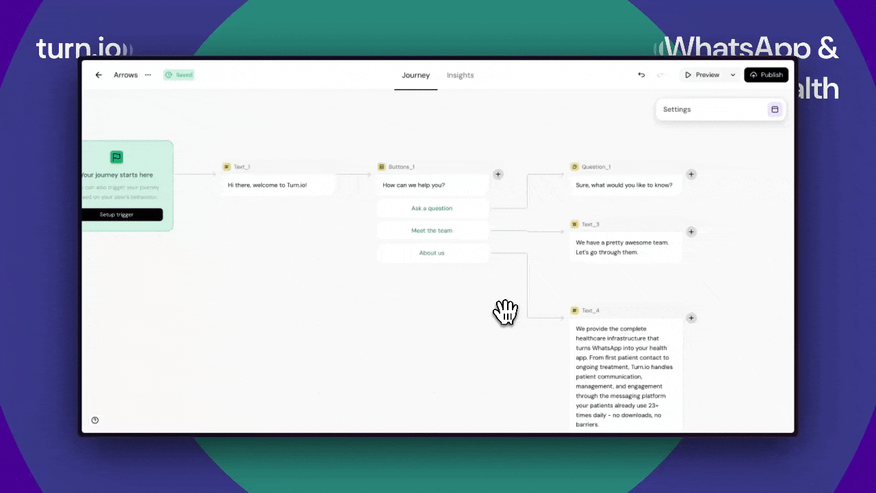
Journeys just got easier to navigate

Journeys can sometimes be HUGE, with hundreds of cards. And when you zoomed out, it was hard to see how it all connected and navigate around.
We've made a bunch of improvements to the look and feel of arrows in Journeys.
Better arrow contrast
Arrows are now darker, both when nothing is selected, and when you selected something. Now, when you zoom out, you can still see the connections:
Highlight everything connected to a card
Now, when you select a card, we automatically highlight everything connected to it - incoming or outgoing. This way, you can easily navigate large journeys by following the highlights:
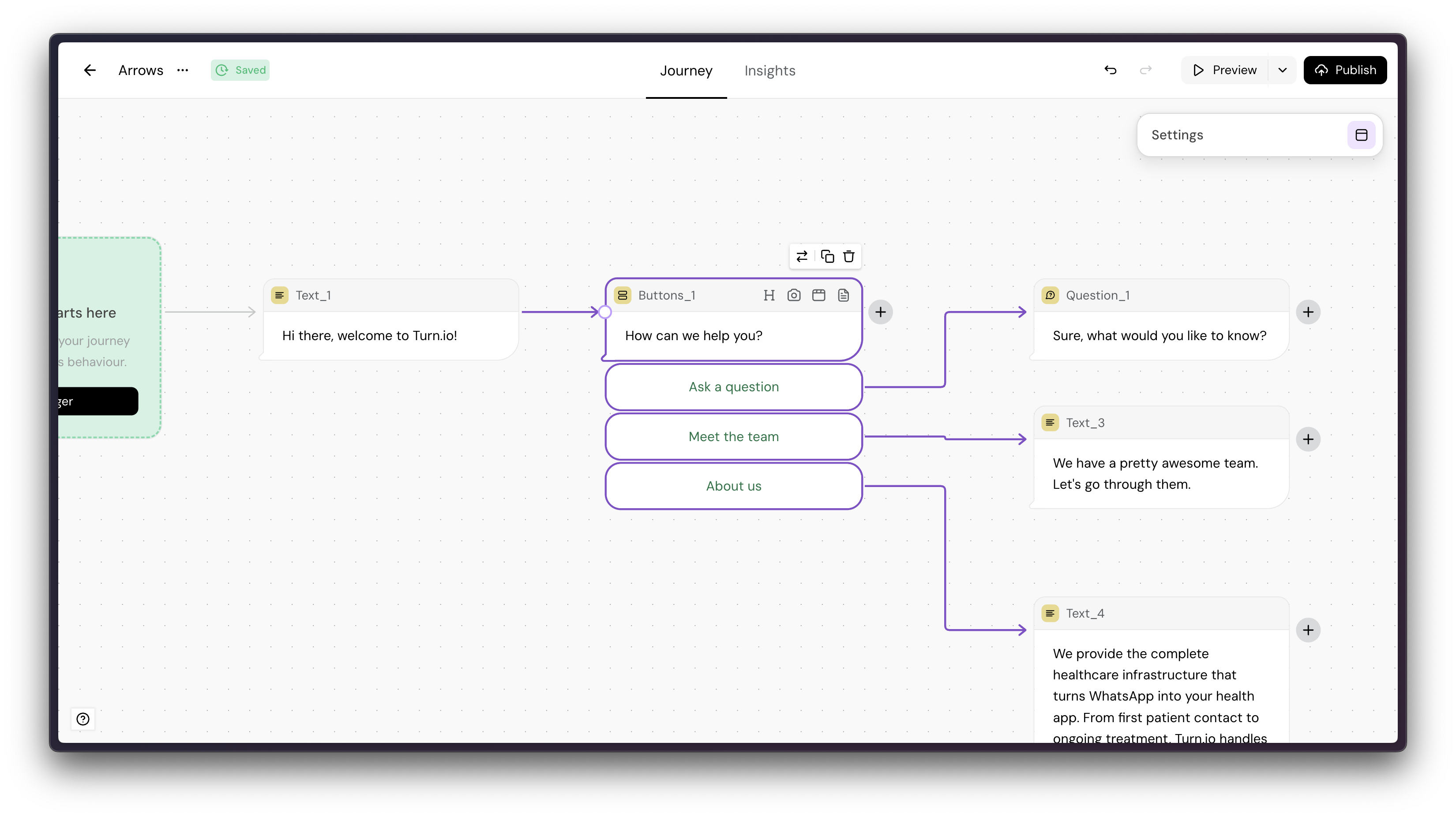
Arrows go on top of cards
Last but not least, it used to be hard to see connections when arrows crossed other cards.
Now, when you select a card, we bring any arrows coming in or out to the top so you can follow along.
What are you waiting for? Get building.